Whenever I’m embarking on a new design project, I typically start by surfing around to see some examples of how similar sites were designed. It’s a great way to get inspired as well as to inform yourself so that you can make sure your design is unique and memorable when compared to what’s already out there.
A lot has been said already about the merits of Jekyll as a minimalist publishing platform, but for a lot of Jekyll bloggers that minimalism extends to design as well. The handcrafted layouts I ran into while I was designing my own blog were some of the strongest examples of minimal, content-centric design that I’ve seen on the web. The 5 sites below are ones that I keep coming back to for inspiration when I’m working with a text-heavy project and a minimalist aesthetic.
1. Warpspire, by @neath
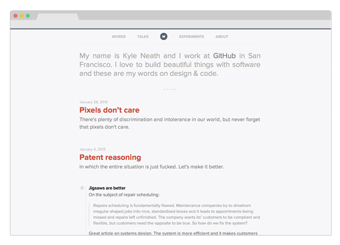
Warpspire is a great example of how a well-chosen and contrasting color palette combined with good vertical rhythm and typography can make a design pop without images or bright colors. Kyle Neath also has some great posts on design, making Warpspire a great place to get inspiration of all kinds.
2. Sparanoid, by @tunghsiao
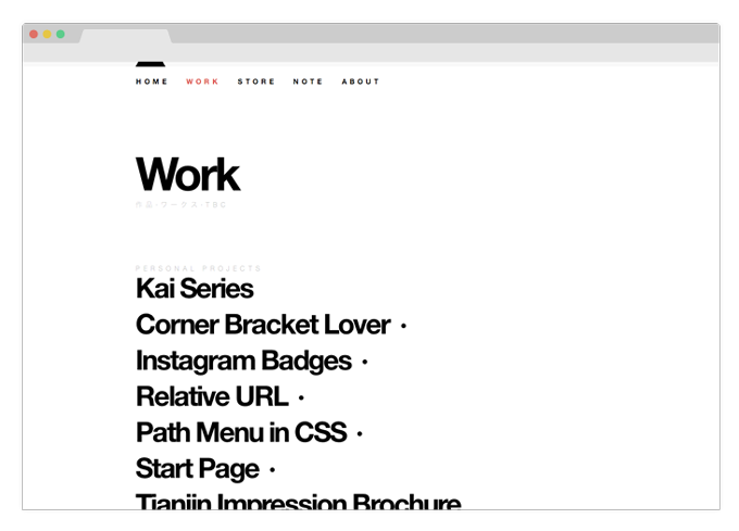
Sparanoid makes great use of hover attributes and a high contrast black-and-white aesthetic to create a spacious feel for the site homepage. Each of the posts is customized with a unique background color and heading icon (some examples), adding personality and playfulness to the design while still keeping a very professional and tight layout.
3. Zach Holman, by @holman
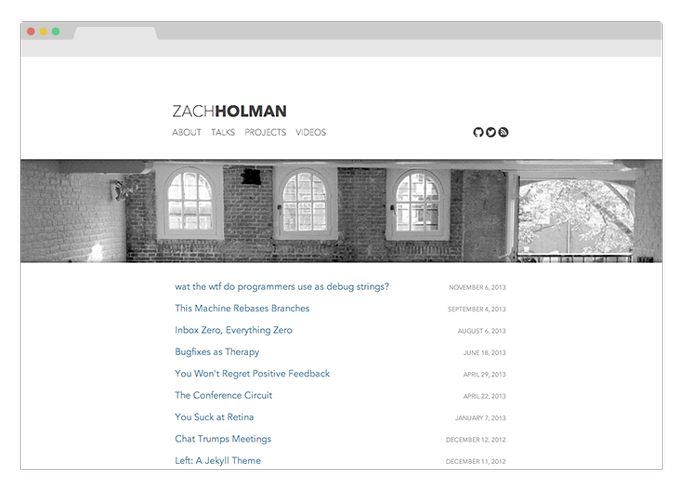
Zach Holman’s website has a really nice layout that makes the most of large images in the header while still letting the content shine. Zach is another GitHubber, and if you haven’t seen any of his talks before you should go check that section of his site out. Not only are his talks interesting and informative, but his slides are great design examples in and of themselves
4. Alex Cican, by @alexcican
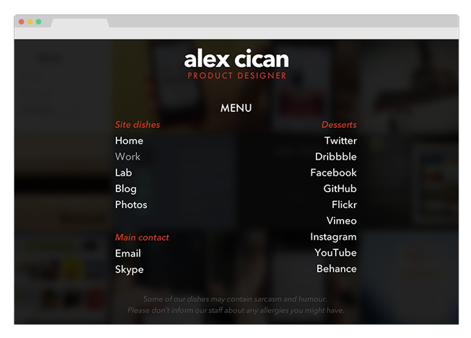
Alex Cican’s portfolio is a little bit rough around the edges in places, but it makes up for it with great use of images and a creative navigation system that mimics a restaurant menu (click the button in the upper right hand corner). It’s a good example of how clean design can still convey a lot of personality.
5. Minimal Mistakes Theme, by @mmistakes
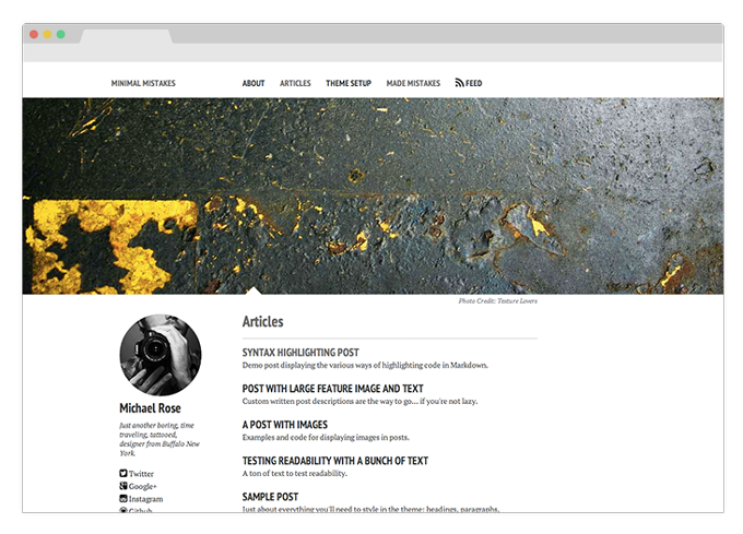
Minimal Mistakes is actually an open source Jekyll theme released by Michael Rose. It’s similar in some ways to Zach Holman’s site, but the thing that I like about it is how it includes a business card-like section of contact information and a photo next to every page on the site. Not only does the extra column help balance the content on the right, but it also adds a call-to-action to each page - if you like the author’s work, a way to contact them is only a click away.
Jekyll is a great blogging platform because of its minimalism - it’s simple enough to be convenient to use as well as not get in the way when you’re trying to use it slightly differently than it was intended. These 5 examples show how simple software paired with stripped-down design can accomplish great things.